 Memorisely
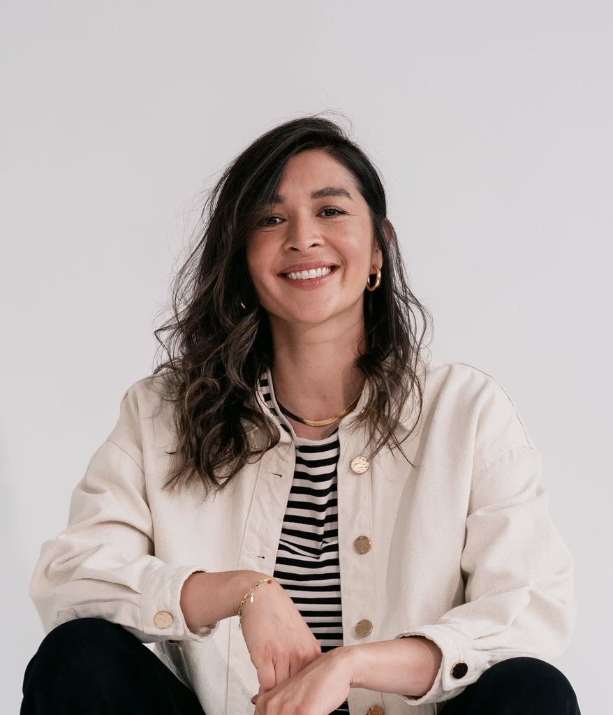
An eye-opening bootcamp! I evolved my design process with AI while connecting with amazing designers. Highly recommend!
EG
Emily Goater
Product Designer
Upskilling product designers, product managers and engineers to design, build and ship better digital products with AI











“I rebuild the same search every Monday”
“I miss new roles overnight”
Shift upstream and make better product decisions with AI from problem to strategy.

 #AI
export function SavedSearches()
return <Card title="Saved">
<SearchRow alerts />
</Card>
---
name: ui-polish
description: Fix spacing,
hierarchy and states
---
# Product design
- Use tokens from tokens.css
- Prototype in Next.js
- Never invent new colours
{
"frame": "Saved searches",
"spacing": 16,
"fill": "surface/raised"
}
export function SavedSearches()
return <Card title="Saved">
<SearchRow alerts />
</Card>
Clear hierarchy
Every state covered
Matches the system
Your balance
$12,480+2.4%
Figma
Subscription
Northwind
Invoice paid
# Product design
- Use tokens from tokens.css
- Prototype in Next.js
- Never invent new colours
Adopt AI with Claude as a Product Designer. Shift into a code-first workflow.
 #AI
{
"action": {
"primary": {
"$value": "{violet.600}"
"$type": "color"
}
}
}
const button = cva("btn", {
variants: {
intent: {
primary: "bg-action-primary"
secondary: "bg-surface-raised"
},
},
});
# Buttons
- One primary per view
- Use action/primary
- Icons sit left of labels
<Button
variant="primary"
size="md"
icon={Save}
/>
:root {
--gray-900: #171716;
--violet-600: #7C3AED;
--action-primary:
var(--violet-600);
}
{
"action": {
"primary": {
"$value": "{violet.600}"
"$type": "color"
}
}
}
# Buttons
- One primary per view
- Use action/primary
- Icons sit left of labels
gray/100 to 900
violet/100 to 600
text/primary
<Button
variant="primary"
size="md"
icon={Save}
/>
Build your design system with AI to design consistently anywhere.
#AI$ npm install
$ npm run dev
▲ Next.js
- Local: localhost:3000
✓ Ready
<main>
<h1>Saved searches</h1>
<ul>
<li>{search.name}</li>
</ul>
</main>
type Props = {
name: string;
alerts?: boolean;
};
// Compose, don't duplicate
export default function Layout({
children}) {
return <body>
<Nav />{children}
</body>
className=
$ git checkout -b saved-searches
$ git add .
$ git commit -m "Add row"
$ git push
$ npm install
$ npm run dev
▲ Next.js
- Local: localhost:3000
✓ Ready
type Props = {
name: string;
alerts?: boolean;
};
// Compose, don't duplicate
> Build saved searches from the PRD
Read the design tokens
Build the SearchRow component
Run the preview
#24 · design/saved-searches
export default function Layout({
children}) {
return <body>
<Nav />{children}
</body>
Shift careers into design engineering by mastering frontend with AI.
#AI<motion.button
whileTap={{ scale: 0.95 }}
transition={{
duration: 0.24,
ease: "easeOut"
}}/>
Extend your UI skills into motion. Create smooth animations and interaction systems with AI.
#AIFor growing design teams
$24per seat / month
Unlimited projects
Shared design library
Priority support
1Weak hierarchy
2Inconsistent spacing
3Low contrast labels
For growing design teams
$24per seat / month
Unlimited projects
Shared design library
Priority support
Pro plan
$24 per month
UpgradePro plan
$24 / month
UpgradeSpot weak UI, build your design eye to create stunning interfaces.
#UISprint
$3k
Build
$8k
Retainer
$4.5k
Scope and outcomes
Timeline
Investment
I help fintech startups turn complex flows into products people trust.
I help fintech startups turn complex flows into products people trust.
Scope and deliverables
Two rounds of revisions
50% upfront
Turn your design expertise into a profitable, sustainable design business.
 #Entrepreneur
Prototype with AI using clean UI patterns and guardrails so flows feel product-grade, not generic template slop.
Tremendous Fantastic
Karate Boogaloo
Motion and micro-interaction patterns that make AI-built UI feel designed, polished, and trustworthy in real products.
Claimable Balance
$18,420.50
Once your bank is connected, balances over $10.00 are automatically eligible for monthly distribution on the 15th of each month.
Claimable Balance
$18,420.50
Net Royalties
$19,158.00
Processing Fee
-$737.50
Ready to Claim
$18,420.50
USD
Once your bank is connected, balances over $10.00 are automatically eligible for monthly distribution on the 15th of each month.
Claimable Balance
$18,420.50
Once your bank is connected, balances over $10.00 are automatically eligible for monthly distribution on the 15th of each month.
Spot AI slop early and fix type, spacing, and components so your product looks intentional, not like a template.
Responsive layout patterns for rails, sidebars, and breakpoints so AI-generated UI adapts cleanly from narrow to wide.
Personal details
Name and email for your account.
Dark theme tokens, contrast, and surfaces that keep AI-generated UI readable and product-grade, not flat gray on black.
Plan your ride
Queens House
|Where to?
Plan your ride
Queens House
|Where to?
:root {
}
Neutral and primary ramps with clear steps so AI palettes stay systematic, not a random set of accent hex codes.
Prototype with AI using clean UI patterns and guardrails so flows feel product-grade, not generic template slop.
Tremendous Fantastic
Karate Boogaloo
Motion and micro-interaction patterns that make AI-built UI feel designed, polished, and trustworthy in real products.
Claimable Balance
$18,420.50
Once your bank is connected, balances over $10.00 are automatically eligible for monthly distribution on the 15th of each month.
Claimable Balance
$18,420.50
Net Royalties
$19,158.00
Processing Fee
-$737.50
Ready to Claim
$18,420.50
USD
Once your bank is connected, balances over $10.00 are automatically eligible for monthly distribution on the 15th of each month.
Claimable Balance
$18,420.50
Once your bank is connected, balances over $10.00 are automatically eligible for monthly distribution on the 15th of each month.
Spot AI slop early and fix type, spacing, and components so your product looks intentional, not like a template.
Responsive layout patterns for rails, sidebars, and breakpoints so AI-generated UI adapts cleanly from narrow to wide.
Personal details
Name and email for your account.
Dark theme tokens, contrast, and surfaces that keep AI-generated UI readable and product-grade, not flat gray on black.
Plan your ride
Queens House
|Where to?
Plan your ride
Queens House
|Where to?
:root {
}
Neutral and primary ramps with clear steps so AI palettes stay systematic, not a random set of accent hex codes.
“I rebuild the same search every Monday”
“I miss new roles overnight”
“I rebuild the same search every Monday”
“I miss new roles overnight”
“I rebuild the same search every Monday”
“I miss new roles overnight”
“I rebuild the same search every Monday”
“I miss new roles overnight”
“I rebuild the same search every Monday”
“I miss new roles overnight”
“I rebuild the same search every Monday”
“I miss new roles overnight”
 Claude Code
 Figma
 Linear
Upskill with Zander Whitehurst
PRDs, roadmaps, and validation with AI across three live weeks with Claude and Linear.
Bootcamp curriculum
$695$495
Path bundleClear hierarchy
Every state covered
Matches the system
# Product design
- Use tokens from tokens.css
- Prototype in Next.js
- Never invent new colours
export function SavedSearches()
return <Card title="Saved">
<SearchRow alerts />
</Card>
Your balance
$12,480+2.4%
Figma
Subscription
Northwind
Invoice paid
---
name: ui-polish
description: Fix spacing,
hierarchy and states
---
{
"frame": "Saved searches",
"spacing": 16,
"fill": "surface/raised"
}
# Product design
- Use tokens from tokens.css
- Prototype in Next.js
- Never invent new colours
export function SavedSearches()
return <Card title="Saved">
<SearchRow alerts />
</Card>
Your balance
$12,480+2.4%
Figma
Subscription
Northwind
Invoice paid
---
name: ui-polish
description: Fix spacing,
hierarchy and states
---
{
"frame": "Saved searches",
"spacing": 16,
"fill": "surface/raised"
}
Clear hierarchy
Every state covered
Matches the system
---
name: ui-polish
description: Fix spacing,
hierarchy and states
---
{
"frame": "Saved searches",
"spacing": 16,
"fill": "surface/raised"
}
Clear hierarchy
Every state covered
Matches the system
# Product design
- Use tokens from tokens.css
- Prototype in Next.js
- Never invent new colours
export function SavedSearches()
return <Card title="Saved">
<SearchRow alerts />
</Card>
Your balance
$12,480+2.4%
Figma
Subscription
Northwind
Invoice paid
Clear hierarchy
Every state covered
Matches the system
# Product design
- Use tokens from tokens.css
- Prototype in Next.js
- Never invent new colours
export function SavedSearches()
return <Card title="Saved">
<SearchRow alerts />
</Card>
Your balance
$12,480+2.4%
Figma
Subscription
Northwind
Invoice paid
---
name: ui-polish
description: Fix spacing,
hierarchy and states
---
{
"frame": "Saved searches",
"spacing": 16,
"fill": "surface/raised"
}
# Product design
- Use tokens from tokens.css
- Prototype in Next.js
- Never invent new colours
export function SavedSearches()
return <Card title="Saved">
<SearchRow alerts />
</Card>
Your balance
$12,480+2.4%
Figma
Subscription
Northwind
Invoice paid
---
name: ui-polish
description: Fix spacing,
hierarchy and states
---
{
"frame": "Saved searches",
"spacing": 16,
"fill": "surface/raised"
}
Clear hierarchy
Every state covered
Matches the system
---
name: ui-polish
description: Fix spacing,
hierarchy and states
---
{
"frame": "Saved searches",
"spacing": 16,
"fill": "surface/raised"
}
Clear hierarchy
Every state covered
Matches the system
# Product design
- Use tokens from tokens.css
- Prototype in Next.js
- Never invent new colours
export function SavedSearches()
return <Card title="Saved">
<SearchRow alerts />
</Card>
Your balance
$12,480+2.4%
Figma
Subscription
Northwind
Invoice paid
Claude Code GitHubFigma
Upskill with Zander Whitehurst
Code-first design with Claude Skills and Figma MCP, prototype to PRs.
Bootcamp curriculum
$695$495
Path bundle{
"action": {
"primary": {
"$value": "{violet.600}"
"$type": "color"
}
}
}
:root {
--gray-900: #171716;
--violet-600: #7C3AED;
--action-primary:
var(--violet-600);
}
# Buttons
- One primary per view
- Use action/primary
- Icons sit left of labels
gray/100 to 900
violet/100 to 600
text/primary
<Button
variant="primary"
size="md"
icon={Save}
/>
const button = cva("btn", {
variants: {
intent: {
primary: "bg-action-primary"
secondary: "bg-surface-raised"
},
},
});
gray/100 to 900
violet/100 to 600
text/primary
<Button
variant="primary"
size="md"
icon={Save}
/>
const button = cva("btn", {
variants: {
intent: {
primary: "bg-action-primary"
secondary: "bg-surface-raised"
},
},
});
{
"action": {
"primary": {
"$value": "{violet.600}"
"$type": "color"
}
}
}
:root {
--gray-900: #171716;
--violet-600: #7C3AED;
--action-primary:
var(--violet-600);
}
# Buttons
- One primary per view
- Use action/primary
- Icons sit left of labels
text/primary
<Button
variant="primary"
size="md"
icon={Save}
/>
const button = cva("btn", {
variants: {
intent: {
primary: "bg-action-primary"
secondary: "bg-surface-raised"
},
},
});
{
"action": {
"primary": {
"$value": "{violet.600}"
"$type": "color"
}
}
}
:root {
--gray-900: #171716;
--violet-600: #7C3AED;
--action-primary:
var(--violet-600);
}
# Buttons
- One primary per view
- Use action/primary
- Icons sit left of labels
gray/100 to 900
violet/100 to 600
{
"action": {
"primary": {
"$value": "{violet.600}"
"$type": "color"
}
}
}
:root {
--gray-900: #171716;
--violet-600: #7C3AED;
--action-primary:
var(--violet-600);
}
# Buttons
- One primary per view
- Use action/primary
- Icons sit left of labels
gray/100 to 900
violet/100 to 600
text/primary
<Button
variant="primary"
size="md"
icon={Save}
/>
const button = cva("btn", {
variants: {
intent: {
primary: "bg-action-primary"
secondary: "bg-surface-raised"
},
},
});
gray/100 to 900
violet/100 to 600
text/primary
<Button
variant="primary"
size="md"
icon={Save}
/>
const button = cva("btn", {
variants: {
intent: {
primary: "bg-action-primary"
secondary: "bg-surface-raised"
},
},
});
{
"action": {
"primary": {
"$value": "{violet.600}"
"$type": "color"
}
}
}
:root {
--gray-900: #171716;
--violet-600: #7C3AED;
--action-primary:
var(--violet-600);
}
# Buttons
- One primary per view
- Use action/primary
- Icons sit left of labels
text/primary
<Button
variant="primary"
size="md"
icon={Save}
/>
const button = cva("btn", {
variants: {
intent: {
primary: "bg-action-primary"
secondary: "bg-surface-raised"
},
},
});
{
"action": {
"primary": {
"$value": "{violet.600}"
"$type": "color"
}
}
}
:root {
--gray-900: #171716;
--violet-600: #7C3AED;
--action-primary:
var(--violet-600);
}
# Buttons
- One primary per view
- Use action/primary
- Icons sit left of labels
gray/100 to 900
violet/100 to 600
Claude CodeFigmaUpskill with Zander Whitehurst
Tokens, components, and docs with Figma MCP wired to code your team adopts.
Bootcamp curriculum
$695$495
Path bundle<main>
<h1>Saved searches</h1>
<ul>
<li>{search.name}</li>
</ul>
</main>
className=
$ npm install
$ npm run dev
▲ Next.js
- Local: localhost:3000
✓ Ready
> Build saved searches from the PRD
Read the design tokens
Build the SearchRow component
Run the preview
export default function Layout({
children}) {
return <body>
<Nav />{children}
</body>
$ git checkout -b saved-searches
$ git add .
$ git commit -m "Add row"
$ git push
#24 · design/saved-searches
type Props = {
name: string;
alerts?: boolean;
};
// Compose, don't duplicate
$ npm install
$ npm run dev
▲ Next.js
- Local: localhost:3000
✓ Ready
> Build saved searches from the PRD
Read the design tokens
Build the SearchRow component
Run the preview
export default function Layout({
children}) {
return <body>
<Nav />{children}
</body>
$ git checkout -b saved-searches
$ git add .
$ git commit -m "Add row"
$ git push
#24 · design/saved-searches
type Props = {
name: string;
alerts?: boolean;
};
// Compose, don't duplicate
<main>
<h1>Saved searches</h1>
<ul>
<li>{search.name}</li>
</ul>
</main>
className=
$ git checkout -b saved-searches
$ git add .
$ git commit -m "Add row"
$ git push
#24 · design/saved-searches
type Props = {
name: string;
alerts?: boolean;
};
// Compose, don't duplicate
<main>
<h1>Saved searches</h1>
<ul>
<li>{search.name}</li>
</ul>
</main>
className=
$ npm install
$ npm run dev
▲ Next.js
- Local: localhost:3000
✓ Ready
> Build saved searches from the PRD
Read the design tokens
Build the SearchRow component
Run the preview
export default function Layout({
children}) {
return <body>
<Nav />{children}
</body>
<main>
<h1>Saved searches</h1>
<ul>
<li>{search.name}</li>
</ul>
</main>
className=
$ npm install
$ npm run dev
▲ Next.js
- Local: localhost:3000
✓ Ready
> Build saved searches from the PRD
Read the design tokens
Build the SearchRow component
Run the preview
export default function Layout({
children}) {
return <body>
<Nav />{children}
</body>
$ git checkout -b saved-searches
$ git add .
$ git commit -m "Add row"
$ git push
#24 · design/saved-searches
type Props = {
name: string;
alerts?: boolean;
};
// Compose, don't duplicate
$ npm install
$ npm run dev
▲ Next.js
- Local: localhost:3000
✓ Ready
> Build saved searches from the PRD
Read the design tokens
Build the SearchRow component
Run the preview
export default function Layout({
children}) {
return <body>
<Nav />{children}
</body>
$ git checkout -b saved-searches
$ git add .
$ git commit -m "Add row"
$ git push
#24 · design/saved-searches
type Props = {
name: string;
alerts?: boolean;
};
// Compose, don't duplicate
<main>
<h1>Saved searches</h1>
<ul>
<li>{search.name}</li>
</ul>
</main>
className=
$ git checkout -b saved-searches
$ git add .
$ git commit -m "Add row"
$ git push
#24 · design/saved-searches
type Props = {
name: string;
alerts?: boolean;
};
// Compose, don't duplicate
<main>
<h1>Saved searches</h1>
<ul>
<li>{search.name}</li>
</ul>
</main>
className=
$ npm install
$ npm run dev
▲ Next.js
- Local: localhost:3000
✓ Ready
> Build saved searches from the PRD
Read the design tokens
Build the SearchRow component
Run the preview
export default function Layout({
children}) {
return <body>
<Nav />{children}
</body>
Claude CodeGitHubFigmaUpskill with Zander Whitehurst
Design engineering with Cursor, Claude Code, GitHub, and Next.js.
Bootcamp curriculum
$695$495
Path bundle<motion.button
whileTap={{ scale: 0.95 }}
transition={{
duration: 0.24,
ease: "easeOut"
}}/>
<motion.button
whileTap={{ scale: 0.95 }}
transition={{
duration: 0.24,
ease: "easeOut"
}}/>
<motion.button
whileTap={{ scale: 0.95 }}
transition={{
duration: 0.24,
ease: "easeOut"
}}/>
<motion.button
whileTap={{ scale: 0.95 }}
transition={{
duration: 0.24,
ease: "easeOut"
}}/>
<motion.button
whileTap={{ scale: 0.95 }}
transition={{
duration: 0.24,
ease: "easeOut"
}}/>
<motion.button
whileTap={{ scale: 0.95 }}
transition={{
duration: 0.24,
ease: "easeOut"
}}/>
Claude CodeUpskill with Zander Whitehurst
Ship motion in the codebase with easing and microinteractions in Claude Code.
Bootcamp curriculum
$695$495
Path bundlePro plan
$24 per month
UpgradePro plan
$24 / month
Upgrade1Weak hierarchy
2Inconsistent spacing
3Low contrast labels
For growing design teams
$24per seat / month
Unlimited projects
Shared design library
Priority support
1Weak hierarchy
2Inconsistent spacing
3Low contrast labels
For growing design teams
$24per seat / month
Unlimited projects
Shared design library
Priority support
Pro plan
$24 per month
UpgradePro plan
$24 / month
UpgradePro plan
$24 per month
UpgradePro plan
$24 / month
Upgrade1Weak hierarchy
2Inconsistent spacing
3Low contrast labels
For growing design teams
$24per seat / month
Unlimited projects
Shared design library
Priority support
Pro plan
$24 per month
UpgradePro plan
$24 / month
Upgrade1Weak hierarchy
2Inconsistent spacing
3Low contrast labels
For growing design teams
$24per seat / month
Unlimited projects
Shared design library
Priority support
1Weak hierarchy
2Inconsistent spacing
3Low contrast labels
For growing design teams
$24per seat / month
Unlimited projects
Shared design library
Priority support
Pro plan
$24 per month
UpgradePro plan
$24 / month
UpgradePro plan
$24 per month
UpgradePro plan
$24 / month
Upgrade1Weak hierarchy
2Inconsistent spacing
3Low contrast labels
For growing design teams
$24per seat / month
Unlimited projects
Shared design library
Priority support
FigmaUpskill with Zander Whitehurst
Type, colour, layout, and components in Figma with live teaching each week.
Bootcamp curriculum
$695$495
Path bundleDescribe a task or ask a question
Turn a product idea into a working AI prototype in one focused session.
Upskill with Zander Whitehurst
Your balance
$6.00
Available balance
$0.01 interest earned
$6.00
Available balance
$0.01 interest earned
🚀3.95% APY
Your balance
$6.00
Available balance
$0.01 interest earned
Refine rough AI output into clear typography, spacing, and visual hierarchy.
Upskill with Zander Whitehurst
@layer components {
.ui-card {
@apply flex flex-col gap-3
@apply rounded-xl border
@apply border-white/10 bg-zinc-900
@apply p-4 shadow-lg
}
}
Turn UI craft into shippable interfaces: layout, components, states, and responsive polish.
Upskill with Zander Whitehurst
An eye-opening bootcamp! I evolved my design process with AI while connecting with amazing designers. Highly recommend!
Emily Goater
Product Designer
As a PM, I used to spend days writing specs that nobody fully read. After the AI Product Management Bootcamp, I show up to kickoff with a clickable prototype instead. The conversations with design and engineering are sharper, faster and so much more fun.
Olivia Bennett
Product Manager
Learning how designers use AI for research completely changed how I think about features. I'm asking 'why' far more often, and our roadmap is better for it.
Elsie Morgan
Software Engineer
One of the most productive and valuable programs I've joined. Excellent content, great energy, and a community that made me feel like I truly belong.
Ricardo Paulo
Senior Product Designer
I joined thinking I'd be the least technical person in the room. Within a week I realised everyone in the cohort felt the same, and that we were all figuring out AI together. Zander and Caro made sure everyone felt welcome, and the conversations with other PMs were some of the most useful of my career.
Liam Carter
Product Manager
The energy in the live classes was infectious. It's rare to leave a session after a full day of work feeling more energised than when you started.
Arthur Kemp
Software Engineer
With so much noise around AI, this workshop was a breath of fresh air. Zander and Caro showed how to use the latest tools in meaningful ways, and created a calm, inspiring space to learn.
Carolina Marchiori
UX/UI Designer
There's so much AI hype aimed at product managers right now, and most of it is surface level. This bootcamp went deeper. I learned how to use AI to synthesise research, pressure-test assumptions and prototype flows before a single ticket hits the backlog.
Amelia Hughes
Product Manager
What makes Memorisely special is the heart behind it. The instructors genuinely care whether you succeed, and it shows in every session and every bit of feedback.
Penelope Ortiz
Software Engineer
Learning with Memorisely feels like pure magic. After three bootcamps, I'm still excited to show up, learn, and grow. The energy, expertise, and heart keep me coming back.
Christel Lamotte
Lead Product Designer
Honestly, the energy was what kept me going. Juggling a roadmap and a full-time job is tough, but the live classes were the highlight of my week. Practical, fun and always up to date.
Noah Fletcher
Product Manager
Hands down the most enjoyable learning experience I've had in years. I didn't just upskill, I rediscovered why I love building products.
Hugo Bishop
Software Engineer
What motion is for in an interface, and the building blocks every designer should understand.
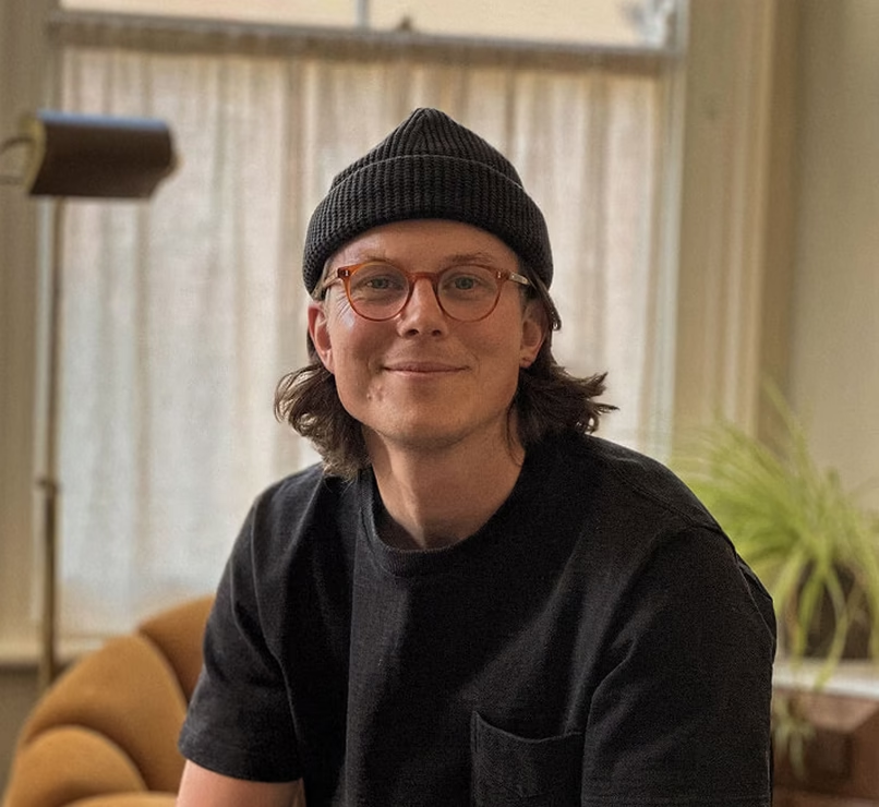
Zander Whitehurst
· 7 min read
The cornerstone guide to designing products with AI, built around the code first approach.
Zander Whitehurst
· 16 min read
A practical guide to keeping leaders, sales and engineering aligned without letting the loudest voice set the roadmap.
Zander Whitehurst
· 8 min read